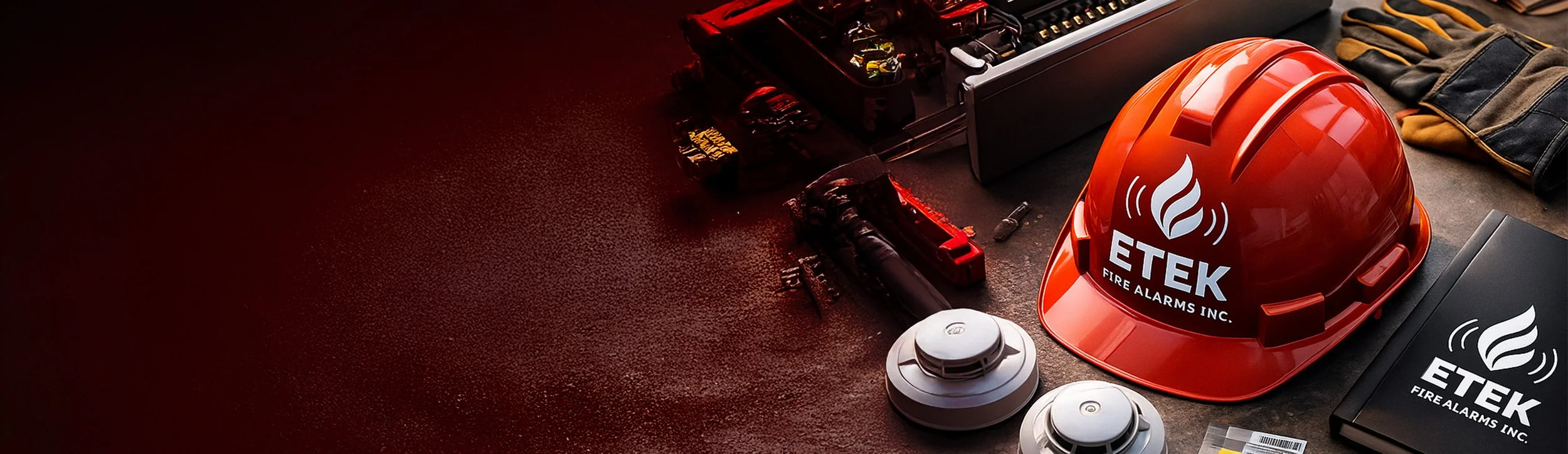
The Challenge
ETEK is a professional electrical and fire-system maintenance company
The challenge was to redesign their brand identity to feel more trustworthy, modern, and industry-ready while remaining simple enough to apply across uniforms, vehicles, and safety documentation.

-
A streamlined, technical-leaning mark built for clarity and long-term recognition.
-
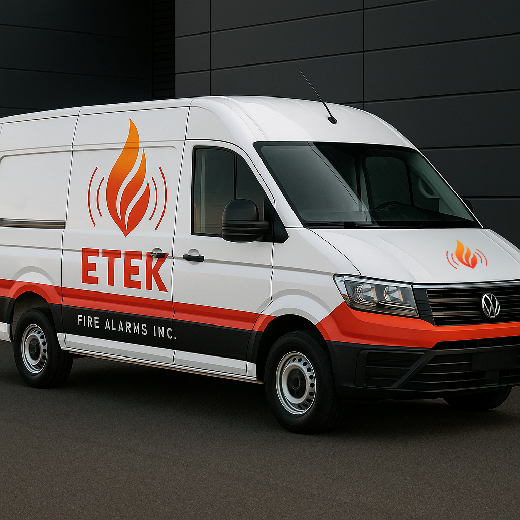
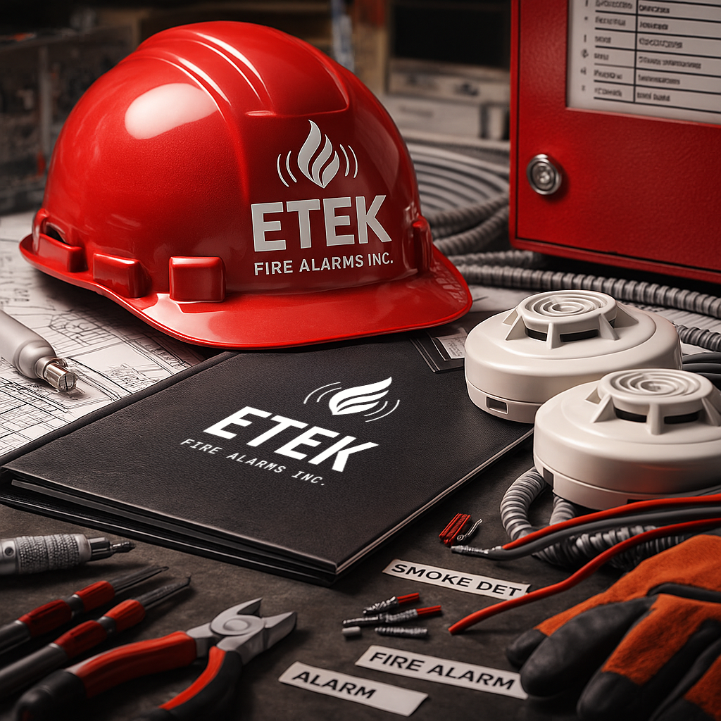
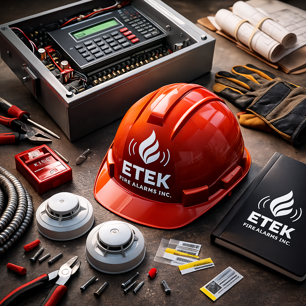
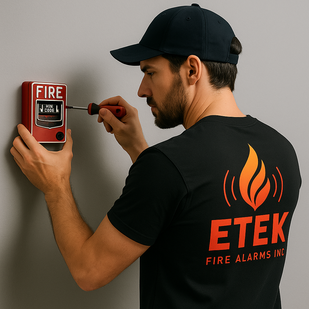
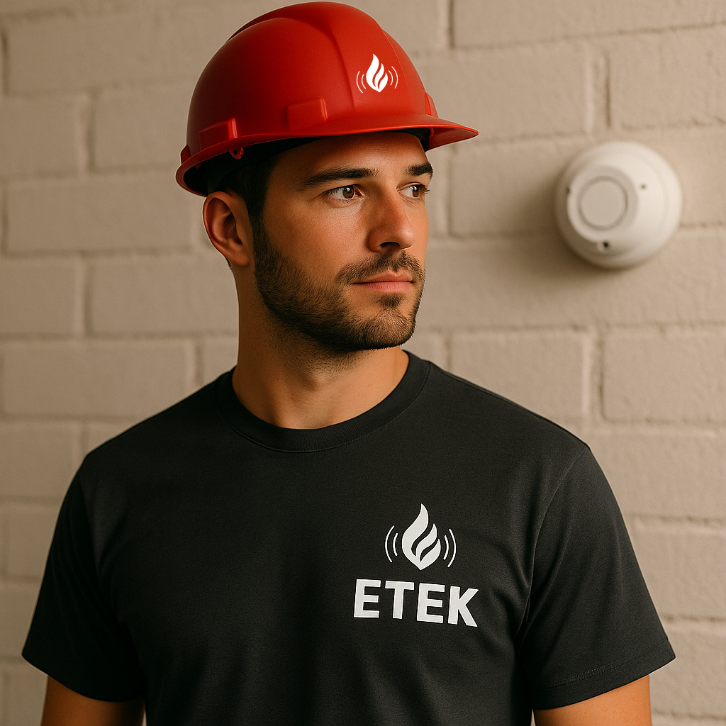
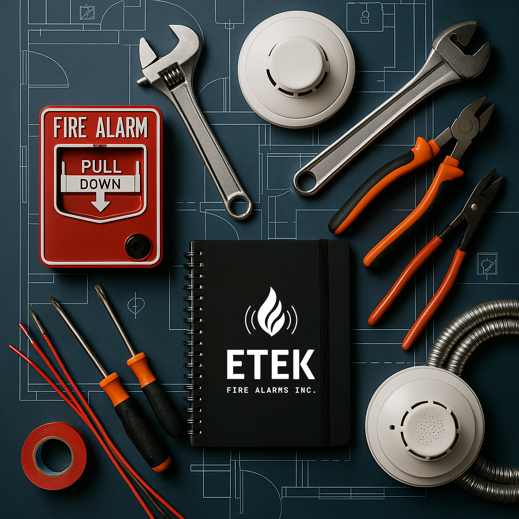
A full visual system adaptable to print, embroidery, decals, and field equipment.
-
Templates for invoices, reports, proposals, and safety sheets to unify client communication.
-
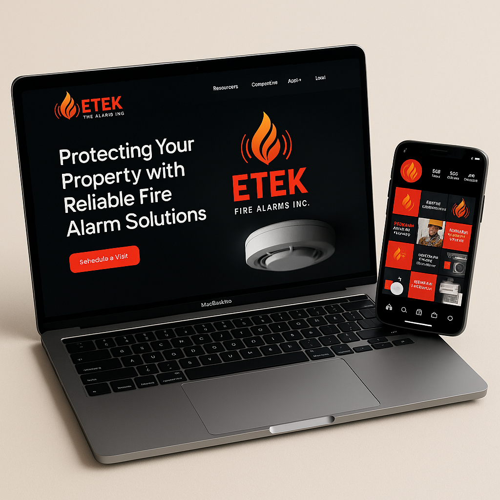
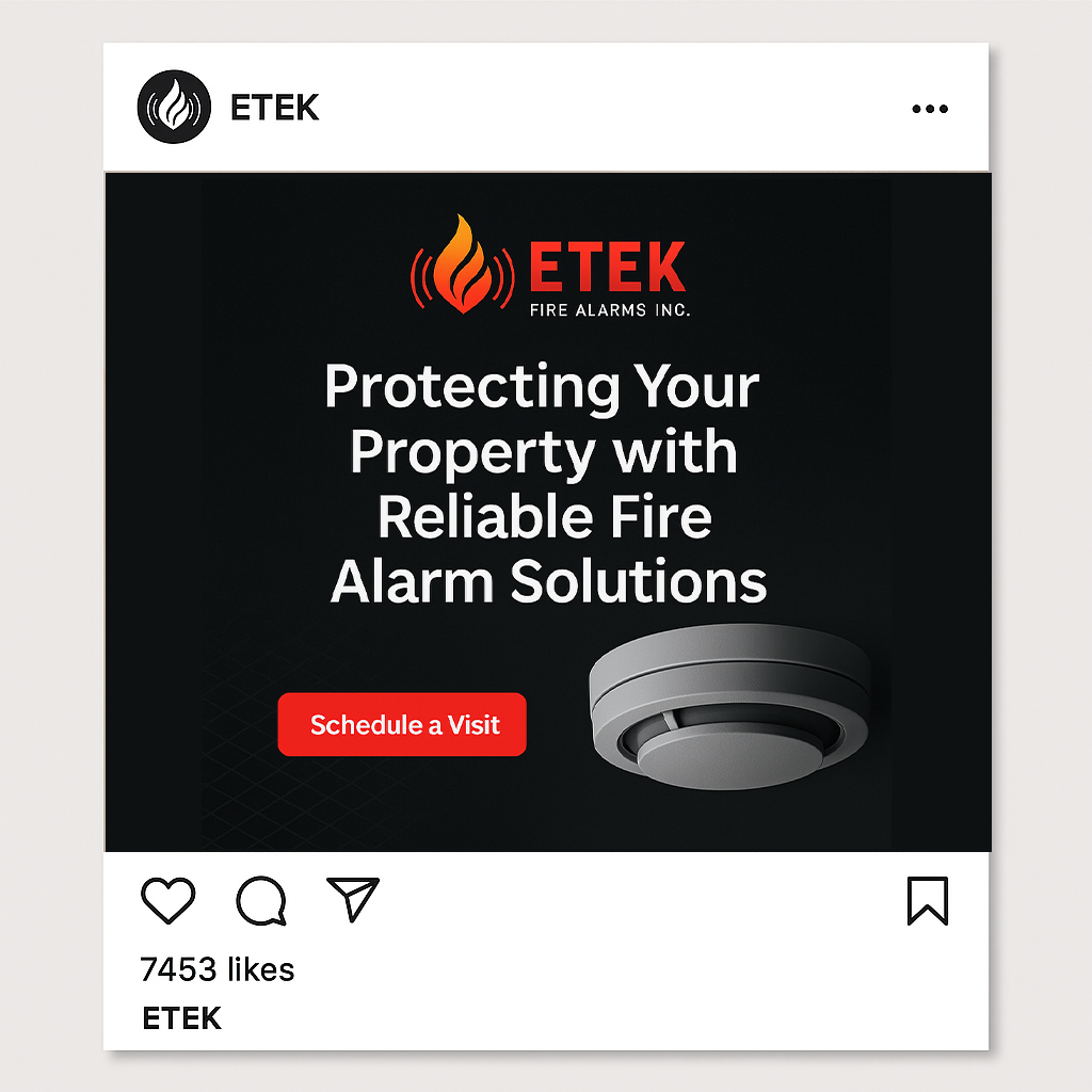
Clean visual direction for their future website and social content.
The Concept
The new design revolves around precision, reliability, and clarity, essential elements in technical service industries.
The visual identity uses clean geometry and bold contrasts to communicate professionalism and safety. The logo and brand elements were crafted to scale effortlessly across vans, signage, uniforms, digital platforms, and client documentation, ensuring consistency and brand recognition.
The Outcome
The redesign gave ETEK a stronger, more professional presence that reflects their expertise and reliability.
The identity now functions seamlessly across fieldwork, operations, and customer-facing materials, improving trust and elevating the overall perception of the brand.


My Design Philosophy
This project showed me how design can simplify complexity, when visuals are clear and intentional, they build trust long before a service is delivered.
Other Projects
-
![Two Instagram posts from el_circulo, a venue in Barcelona, Spain, promoting networking events. The first shows a traditional Japanese-style room with a garden, advertising a networking night on April 15th at 8:00 PM with free entry and special guests. The second shows a group of people sitting on a patio, engaging in conversation, with the venue's logo in the bottom corner.]()
AestheticFit — Brand Identity
A modern visual identity designed to elevate a fitness brand with bold energy and clean, empowering aesthetics.
-
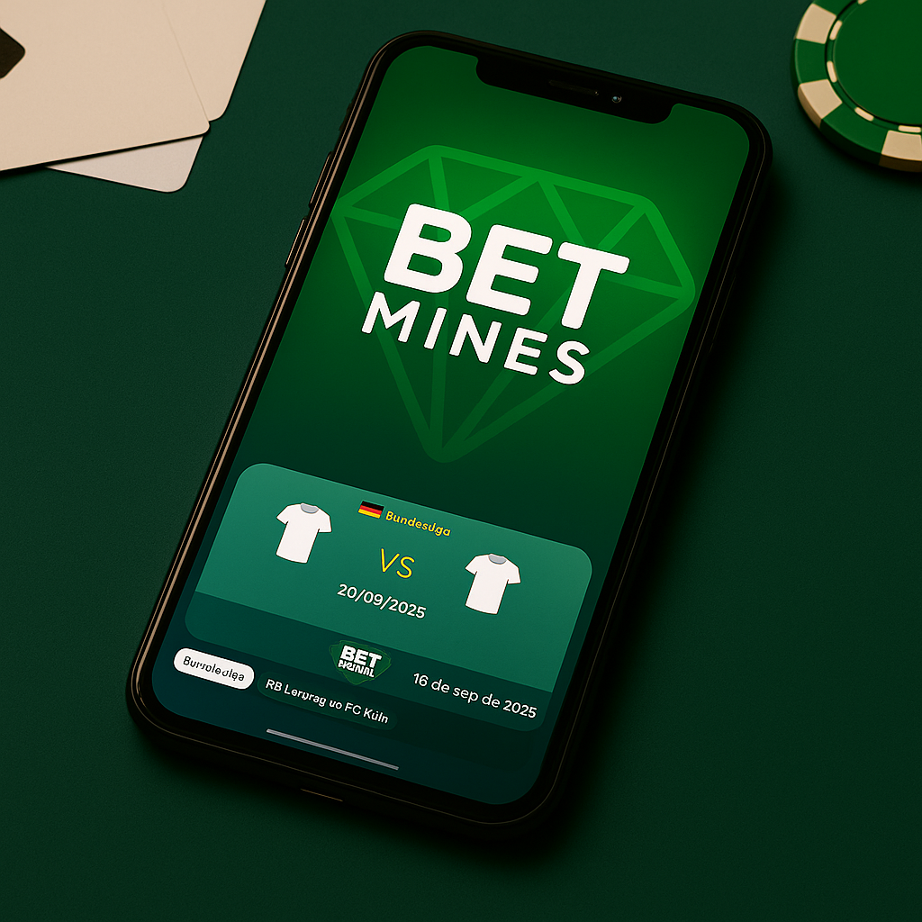
![Green background with a faint diamond-shaped gem outline and the words 'BET MINES' in bold white letters.]()
BetMines — Brand Identity
A dynamic logo system built to capture the excitement of sports predictions through bold shapes and clean geometry.
-
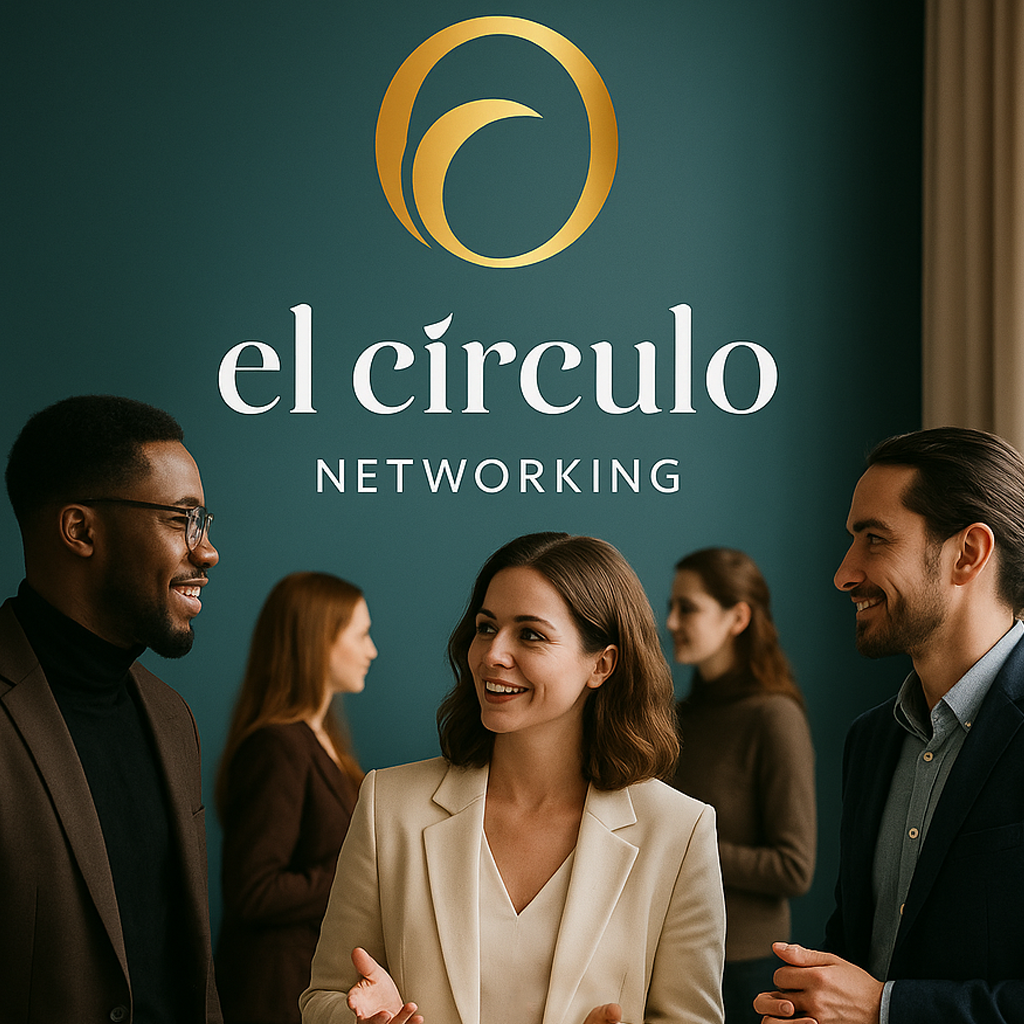
![Modern building with wooden exterior, large glass window, set against a mountainous landscape with grassy foreground.]()
El Círculo — Networking Branding
A refined brand concept created to highlight community, professional growth, and meaningful connections in modern networking.
-
![A modern wooden house with a slanted roof, situated in a grassy field with small trees, overlooking a lake and distant mountains under a cloudy sky.]()
ETEK — Tech Brand Identity
A streamlined identity created for a tech-driven company, blending modern precision with bold, functional design.
-
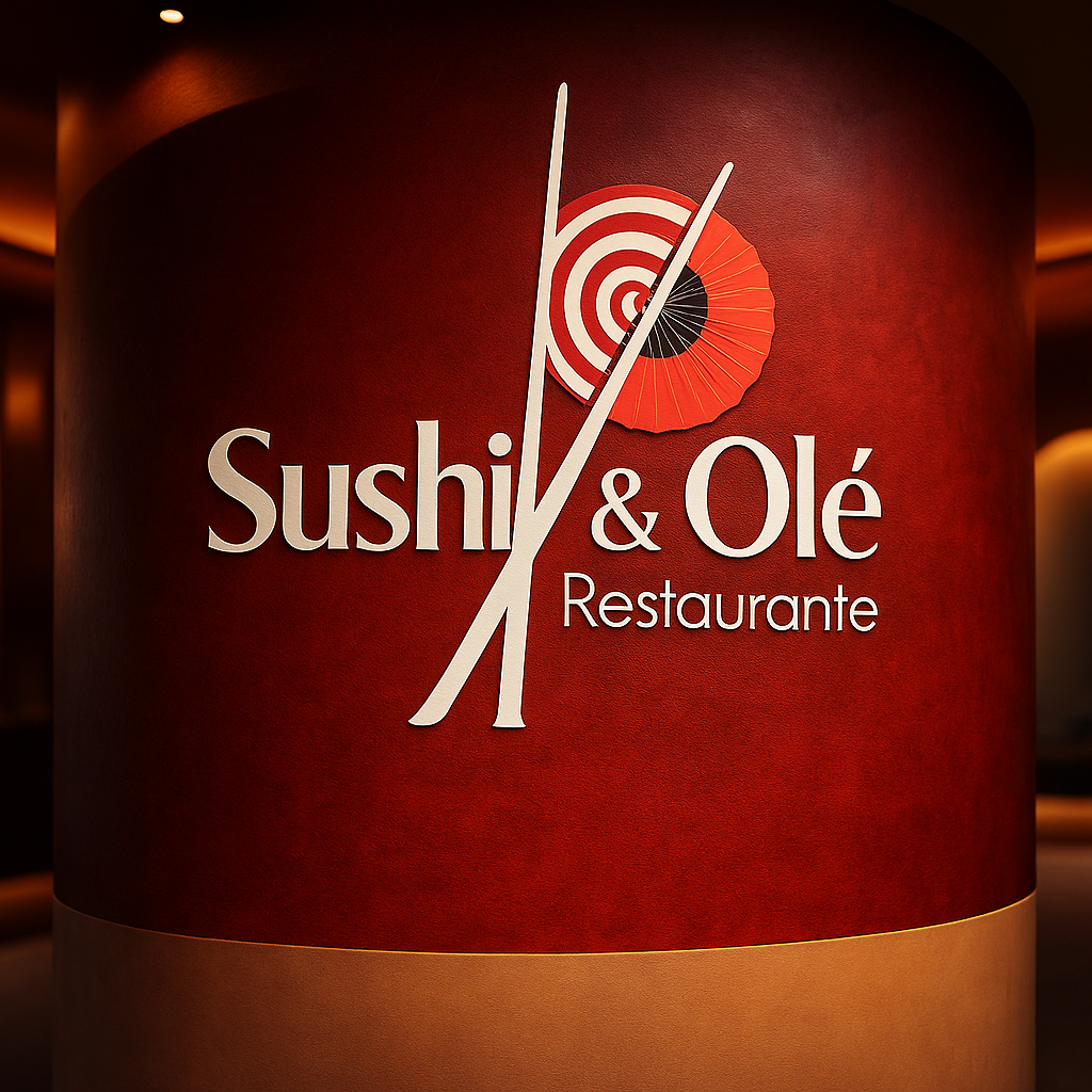
![Sign with restaurant name 'Sushi & Olé Restaurante' featuring a target and paper umbrella logo, with chopsticks crossing through the text.]()
Sushi & Olé — Restaurant Branding
A fusion-inspired brand identity combining Japanese elegance and Spanish warmth into one cohesive visual system.